Monday, March 10, 2014

Shop Spring Items

With just 10 days left of Winter, Spring is finally around the corner! And as with every change of season, comes a new array of colors, patterns and designs. Here's some new items to start the season off with... 

Stationery and Notecards
Add a burst of color and pattern to your sentiments this season with our carefully crafted notecards and stationery sets.  Each set is printed on our linen textured card stock for a luxurious and smooth feel with careful attention to the trend-worthy colors of Spring 2014.

Cherry Patterned Notecard Sets in cream, bluebonnet blue, peacock blue and teapot blue
Diamond Patterned Notecard Sets in dazzling blue and sand

Colorful Feather Patterned Notecard Sets in Pantone Colors

Feather Patterned Notecard Sets in freesia

Monogrammed Lattice Notecard Sets in hemlock, radiant orchid and cayenne pepper
Gift Tags
Adorn your shower favors and gifts with specially crafted and customized gift tags made from layered, textured card stock.  Gift tags make the day extra special by adding a homemade feel to bridal and baby showers and special get togethers.  You can select your own color schemes, text and image to fit the theme of your event.

Additionally, Treat Bag Toppers are great for kids parties to add that finishing touch to homemade treats or small favors.  You can select the theme of your topper to match the theme of your party.

Custom Shower Gift Tags in blush and cream
Custom Treat Bag Toppers

Banners
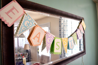
Intricately cut and layered card stock comes to life in the form of decorative banners.  Banners can be hung from mirrors, doorways, stairways, cabinets, sofa tables, tv stands, walls and more. 

Additionally, you can request custom banners for birthday parties, showers and nursery decorations.

Shamrock Decorative Banner
Easter Letters Decorative Banner

Easter Decorative Door Banner

Shamrock Decorative Door Banner
Postcard Invitations
Reduce the cost but not the style of your invitations this season by sending out Postcard Invites.  Postcard invites cost less to mail and can be printed through online retailers for as little as $22 for 100!  Pantone inspired colors, classic patterns and creative backgrounds make these invitations pop off the page!  Postcard backs are also available to create a cohesive invitation from front to back.
Custom Chevron Patterned Postcard Invite in honeysuckle

Custom Pennant Postcard Invite in quarry

Custom Chalkboard Postcard Invite

Custom Beach Postcard Invite

Custom Colorful Lattice Postcard Invite in mustard

Have something else in mind?  Any of the designs can be customized and reworked to fit your needs.


Wednesday, February 5, 2014

2014 Color Report

As winter wears on, spring colors and patterns start to give us hope that there is something to look forward to beyond the drab, gray sky.  Color plays such a pivotal role in everything we surround ourselves in - clothing, paint, fabrics, etc.  And even though it seems like such a simple, almost unchanging thing - it is anything but simple.

Like anything else in our culture, color is something that has a trend.  Where does it begin? Typically we look at color trends during New York Fashion Week as designers unveil their Spring collections for the following year.  This really sets the stage for what the consumer marketplace will offer come spring.  The color palette each year is large and encompasses everything you can imagine from warms to cools.  In a lot of cases the colors are various hues from seasons past.

Let's take a look at the Color Palette for 2014…

As you can see there are a lot of jewel-tones, brighter pastels and calming neutrals.  So by looking at this palette, we can determine what will be flooding our marketplace this coming year.  So if we want to be ahead of the trend, we can start planning accordingly.

Fortunately, the wonderful color experts of Pantone have narrowed that large palette down to the top 10 colors of the year, as determined by percent of designers utilizing the color.  Our top three colors are all trending in the bold, cool color family:  dazzling blue, violet tulip and radiant orchid.  Coincidently, radiant orchid (ranked third in the mix) is also Pantone's color of the year for 2014.

bold cools:  dazzling blue, violet tulip and radiant orchid
Next on our list are bright warms.  Here we see those colors usually associated with summer appear.  Interestingly, Pantone has paired these colors, like the bold cools, with names that give the color some additional life.  Violet tulip, radiant orchid, celosia orange, freesia are all floral in name and perfect for that shock of spring.

bright warms:  celosia orange, freesia and cayenne
Lastly, we have our calm pastels:  placid blue, paloma, sand and hemlock.  Again, Pantone has cleverly marketed these colors with word associations that are both plant-like and peaceful:  paloma derived from the Latin for dove, sand reminiscent of the beach, the hemlock plant, etc.

calm pastels:  placid blue, paloma, san and hemlock
Either way you look at the list, we have 10 fresh colors to design, paint, sew and live with, and around, this year.  Of course, fashion and fabrics will be most impacted, so you might take notice of these trending colors when you begin planning your spring wardrobe this year.

The other area, aside from fashion, that will be impacted by the color trends of 2014, is weddings.  Weddings are such a large industry that the 2014 palette has been tweaked to accommodate the most fashionable and color-conscious bride.

wedding trend:  similar tones of our 2014 palette
Almost immediately you'll notice similar tones in mustard yellow, satsuma orange, burlap brown and quarry gray.  We also have an earthier version of our green in cedar and a jewel-toned deep teal that is brilliant enough to stand on its own against dazzling blue.

For anyone that has picked up a Serena and Lily catalog lately, you'll notice some of their staple colors appear throughout the 2014 palette.  So we are already seeing these colors impact our marketplace, not only in fashion, but in the world of home decor.  In fact, my shower curtain is a feather-patterened mustard from Serena and Lily.
As a designer or consumer, color is huge.  Whether your acknowledge the trend in colors or let the buyers of your favorite store determine them for you, color is all around us.  Concrete proof is only a Amazon search away.  Pantone has really capitalized on the concept of color trends by marketing mugs, cell phone covers and books devoted to their own palette of colors.  (I've included some of my favorites below.)  Ultimately we all are drawn to our favorite color or colors, and Pantone has marketed to that uniqueness.   


Pantone iPhone Cover
Pantone Mugs

Pantone Coasters
So what do you think?  Are you color conscious?  Is there a color for you this year in Pantone's 2014 spring collection?  Will this impact any of your buying decisions?


Speaking of designing with color…here are the latest designs for wedding season inspired by this year's palette…


Wednesday, January 29, 2014

DIY: Framed Fabric Art


When I was looking to decorate two walls in my my townhouse apartment with wall art, I can honestly say that I looked through all of my normal go-to stores:  Hobby Lobby, Pier One and Home Goods without having any luck.  I knew that I wanted to break-up the rather large walls in both my kitchen and bedroom with multiple pieces of wall art of some sort.  To me multiple pieces create a unique negative space between the objects that can be as interesting as the wall art itself.

I happened to be thumbing through my Serena and Lily catalog and really fell in love with the array of patterned fabrics they had to offer.  It got me thinking - since I was having no luck finding pieces, why not make my own using fabrics.  Fabric is very affordable and the possibilities for patterns and textures are endless.  I started googling fabric almost immediately and found a great website, Fabric.com.

Now Fabric.com is both wonderful and daunting at the same time.  For someone who loves design, it is heaven.  I was able to search for colors, patterns and textures quickly and compare different fabrics side by side with ease.  The problem was ultimately narrowing down my choices.  In my mind the best method of sorting through the options is to start with your base color in the room - in this case I was looking for something similar in both the kitchen and bedroom - a teal or pool blue color.  Once I was looking through the teal options I was looking at patterns that appealed to me - patterns with lots of complimentary colors and movement.  Movement in a pattern is important when you're hanging something on a wall - you want to make sure your eye never stops moving over the piece: following undulating curves, circles, endless lines, etc.  This really brings those patterns, and in turn your wall, to life and keeps your eyes interested.  I ended up ordering a yard of each fabric, which would be more than enough for what I had envisioned for my walls.

While waiting for my fabrics to arrive, I immediately started searching for frames to house these pieces of fabric.  Since my patterned fabric had a lot of movement and color I didn't want to take away from it, so I decided to search for simple, monotone frames.

Fortunately, Amazon has a wide array of choices and sizes to pick from and they are mostly all affordable.  In my mind's eye I wanted to do a straight line of spaced smaller square frames on my bedroom wall and a gallery configuration on my kitchen wall.  Since I didn't want to outshine the fabric, I searched for black frames in the bedroom that would match the furniture finish I had on my headboard and nightstands.  This would provide a continuity between the pieces of furniture and frames as well as letting the fabric come to life against the dark wood in the room.  Now in the kitchen, I have white cabinets, natural colored counter top, white appliances and a silver shelving unit to house my appliances.  I decided to try and keep somewhat of a continuity again by looking for silver frames for the kitchen.

The black frames I decided on were square and simple.  And while I liked the frame by itself with a mat, I knew when I purchased it that the mat had to go.  I also kept in mind that I saved money by using fabric and could swing spending some extra money on the frames.
 

The silver frames I decided on were rectangular and I figured I could play with positioning them in different ways to make a unique shape and pattern on the wall.  Again, looked for simplicity to balance the pattern of the fabrics I chose.


Once I had all of my frames and fabric in hand, I went ahead and removed the matting, I wanted to fill the entire space up with fabric and just have the frame itself act as a simple border.

I did, however, use the mat as a template when positioning and cutting my fabric.  I placed the mat on top of the fabric and positioned it to frame a part of pattern that I really wanted to frame.  I didn't want to just choose a piece of pattern because it is on the border, I wanted to pick the portions that would look good by themselves and act as a piece of art - they should be visually balanced in and of themselves.  Then I traced the mat with a pen onto the fabric, adding an extra inch and a half to each side and cut it out.  That extra inch and a half is important as you'll read later.  Once I did this for each of the frames I went ahead and ironed the fabric pieces to ensure that most of the wrinkles would not show up in my frames.  I still had a few wrinkles after everything was said and done, but I do think little things like that add to the overall texture and appeal of the piece - so I let it happen.

Once I ironed my fabric, I went ahead and placed them in the frames.  I then layered the pieces of the frame behind the fabric, so the white paper that comes with all frames (white side out), the mat and the frame back itself.  Once they were all put in, I was able to pull the extra inch and half of fabric on each side to smooth out the fabric behind the glass.  This smoothing is crucial to making the finished project look presentable and ultimately hangable on your wall.  Once I had the fabric smoothed out where I wanted it, I taped the excess fabric down to the frame back with masking tape.  You can use whatever adhesive you like, I just find that masking tape is the easiest to remove without damaging any part of the project should I want to change it in the future.

Ultimately, I was very pleased with the results.  I think the patterns I chose bring movement and vibrancy to both spaces, they were affordable and I can change them easily should I want to without having to buy all new pieces.

As a side note, you can buy cheaper frames on Amazon in sets that would also be great and probably more affordable yet.  The set of 7 frames below would be perfect for the same project to add variety and a finished gallery look.


Here's my final project:


Sunday, January 26, 2014

Villain Collection

It is no surprise that I'm a huge Disney fan.  I've probably been to Walt Disney World at least 10 times in my lifetime, with another booked trip in September of this year.  For my Facebook friends, my page is full of Disney pictures and ride check-ins for a solid week each year.

A big part, if not the quintessential part of my Disney obsession is the films.  Disney films were always my favorite growing up and remain so today.  I think there is something that speaks to everyone in those classic animated films that I remember growing up with:  Snow White, Cinderella, Sleeping Beauty, The Little Mermaid, The Lion King, Aladdin, 101 Dalmatians, Beauty and the Beast, Robin Hood, Peter Pan, Alice in Wonderland…and the list goes on.  The songs, princesses, heroes and sidekicks were always entertaining, but to me sometimes the most entertaining characters were the villains in these movies.  To this day I still think Maleficent is a classic villain albeit in animated form.  Her voice was creepy, she looked evil - she was the whole package of a perfect villain.
Well in looking for inspiration for a complete, handmade notecard collection I turned to these classic villains from my favorite animated films.  Of course at the top of my list were Maleficent, Ursula, the Evil Queen, Gaston and Scar.  But I wanted to showcase these characters in a way that made them relevant to the pop culture of today.  So if the Evil Queen, Cruella and Maleficent were in a high school cafeteria they would be the epitome of mean girls.  Gaston would blame your break-up entirely on you.  Ursula would suffer from extremely high self-esteem.

Needless to say the process was time-consuming:  pairing the characters with a witty saying (well hopefully witty), tracing and editing them to fit on paper and making them something that I would use in my daily life.  As I said before, everything I make is something I would use - so the challenge is always designing for myself and for my own aesthetic.  

I'm thrilled with the way the nine designs came out.  The characters are able to come to life by literally popping off the page with some pop adhesive and fun sayings.

I decided to split the nine designs up into three sets which will be posted on klm Creative starting today. The second set is scheduled for a week from today and the third set for two weeks from today.  Depending on the success of the sets, I may or may not offer a deluxe set of all nine designs.

Here are the completed design photos:


Banana Bread French Toast

Over the holidays, my neighbor, Linda, shared with me that every Christmas Eve she cooks a big breakfast for her family.  One of the favorite menu items that she makes every year is a banana bread french toast.  First of all, those are two of my favorite things:  banana bread and french toast.  To find out that she had combined these two items was inspiring to say the least.

Now I normally prefer to come up with my own recipes or work from a basic recipe when trying new things, but as far as baking my own banana bread for a french toast, I figured I could cut some corners.  Fortunately, Betty Crocker sells a banana bread box mix that was on sale last week.  Unfortunately, I did not read the box recipe until I was home - it calls for mashed banana, and that's something I don't keep on hand.


Well I finally got my banana, and I baked the banana bread following the directions on the box yesterday. 


This morning I sliced it up and made it into French Toast.  It wasn't as firm as I would have hoped, but the taste was phenomenal.  Now for those Disney fans that have tried Tonga Toast over at the Polynesian, don't get your hopes up - this was no where near as good as that brick of delicious, cinnamon-sugar covered gold.  But it is something that I would definitely make again, especially if I was entertaining for breakfast.  I think the combination of a baked quick bread and a breakfast staple elevates both components nicely.  Plus I'm sure a sprinkling of powdered sugar would make it look much classier than how I enjoyed it this morning…


I'm sure everyone has their own recipe for French Toast, and I just worked from my classic recipe:  2/3 c milk, 4 eggs, 2 tsp cinnamon, pinch of ground sea salt, two pinches ground cloves.

Getting started


After launching klm Creative over on etsy , I honestly felt I was slightly limited to only showcasing items that were finished products.  A lot of what inspires me is not only good design, but also the journey through design to that finished product.  While I'm passionate about creating objects that are  beautiful and visually balanced, I'm also drawn to home decor projects, entertaining, cooking, media, etc.  So my plan is to use this space to showcase my process, inspiration and whatever other items might be influencing me at the moment.  If anyone has taken the time to read the About Me section over at the shop, I stated that many of my creations were from a need in my personal life.  Hopefully that part of my process will come to light through sharing on here.

I'll be honest, this is my first time sharing in this capacity, so it will be touch and go for a while.  Here goes nothing…